Deploying Parachute in a Crowded Sky!

What did a trusted FMCG brand, used by millions of Indian households, have to consider when it decided to foray into a new category? A lot, because the brand was Parachute Advansed, looking to set foot into the lucrative baby care category.

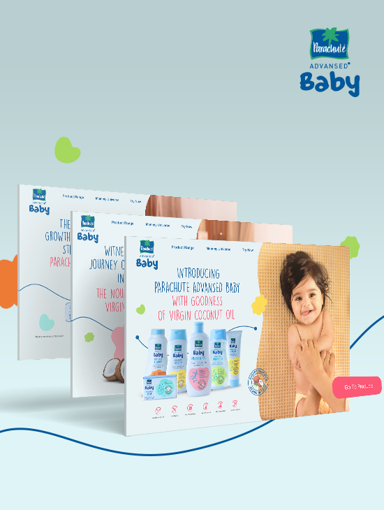
Entry barriers are unusually high for any new entrant in the baby care category, involving breaking preconceived notions and winning the trust of mothers. Parachute Advansed was not taking it easy. Realizing the preference for organic contents, they sought to create a storytelling website that could convey their narrative to mothers, emphasizing the benefits of virgin coconut oil for their baby’s growth.

Built with Love & Care, Just Like Mothers!

More than just developers, we donned the hat of a mother to establish a compassionate and empathetic connection with new moms, including first-time mothers, with meticulous review at every step of their journey. We recognized that our website needed to address the following demands, in line with the realities of motherhood:

  • Time constraints: Content should be optimal yet effective, as mothers won’t have much time.
  • Patience: The website should have lightning-fast load times to accommodate their limited patience.
  • Device preference: The website should offer a mobile-first experience, as their preferred device will be mobile.
  • Inquiries: The website should rank high on result pages to address their numerous questions.
  • Community: An environment is needed where first-time moms can explore and discuss their experiences with others.
  • Scalability: As kids grow, the website should be scalable to align with an ever-growing product portfolio.

A Website as Smooth as the Product

With adequate consumer insights and information about common pain points, we conducted exhaustive research on category websites before outlining key aspects such as content buckets, creative approach, web strategy, and sitemap.

Using Figma, we developed wireframes that helped the brand understand the user flow, content hierarchy, and structure through a tangible representation, allowing them to envision their real website.

With a state-of-the-art technology stack, we built a robust and forward-thinking framework to meet present and future development needs.

Built with Care!

Understanding that expectant working mothers would spend more time on laptops for research, we designed a book-style navigation experience for desktops. By deploying Next.js technology, we ensured lightning-fast load times, so moms wouldn’t have to wait even an extra second. The responsive parallax pages enhanced the visual experience, while beautiful images of toddlers, right-sized content, and a warm tone ensured an emotional connection with mothers.

SEO friendliness ensured higher user uptake, and the uniformity of custom design for each page helped in creating a seamless user journey. The addition of a blog-cum-community section helped mothers connect and share experiences. Finally, with dynamic product pages, the Parachute team could keep expanding their product offerings without worrying about the website’s scalability.
backtotop